
Tutorial – Skate Deck Design
I’ve been wanting to write a tutorial for a long time now, and I’m thinking that with December finally coming to a close, which means work is going to start picking up again, getting my first public tutorial under my belt is a good way to kick off the new year. As I mentioned in a previous post on my blog, I had some time to compete in a design contest being supported by Element Skateboards and Vapors Magazine for the hip hop artist, Lupe Fiasco. The contest will be taking place and the winner will be posted on imeem sometime in January. So I’ll be writing a step-by-step tutorial on how I went about creating my entry and some of the techniques including Illustrator brushes, repeating patterns and some advanced techniques that I often use.
The best way I can think of to break up this tutorial is to separate out the 5 main parts that compose this piece; 1) Readying the Elements 2) Crest Illustration 3) Portrait Illustration 4) Repeating Pattern 5) Layout.
1) Readying the Elements
Lupe and the folks supplied the following elements that had to be used this deck design:

Heart Locket

Skull

Skeleton Hand

“The Cool” Album Logo

“The Trinity”

Vapors Magazine’s Logo
And Element provided their logo in .EPS format as well.
Step 1
All of the provided elements with the exception of the Element logo were very Hi-Res JPEGs. While the images are big enough to work with at the required size, I knew that I’d be creating my artwork solely in Illustrator and I’d be better off with 100% vectors for this project. Some of the techniques I’ll be using might work pretty much the same in a raster image application such as Photoshop, but I always prefer to work in vector because of its scale-ability
and ease of manipulation. So for this project we’ll have to convert our JPEGs to vector format.
For this you could use Illustrator CS2 or CS3, Adobe Streamline, Corel or some other software, but in this case, the best tool I’ve found for converting Hi-res images is a website called Vector Magic.
The site is very straight forward and walks you through the vector conversion process. There’s a trick or two that can be learned along the way to make your vectors come out a bit smoother which I may get into in a future tutorial, but I have a lot of ground to cover, so for now I’ll just assume we can all follow directions.

Make sure you select 2 colors for your palette so you’re vector comes out in only black and white. We’ll have some finessing to do back in Illustrator since we can’t choose to only create the black and leave out the white as we can using Live-Trace.
Click “Finish” complete the conversion process. Click the “Download .EPS” button to retrieve your final result and then we’ll repeat the process for any additional images we need vectorized.
Step 2

Now we need to get rid of the white left in our vector so we’re only left with the black that we’ll be using in our final design. The easiest way to see what ares are white relative to the areas that are merely our artboard is by turning on the GRID (cmd+”). Now we’ll need to ungroup the artwork and delete the white areas around the edges.
Note: you can click on any image in this tutorial to see a larger version.Step 3

We’ll use the subtract tool to cut the white areas that are left out of the black areas until we’re left with nothing but black. So start selecting areas of white and the remaining black group behind it and click subtract to remove the white. Send the black areas to the back of the stacking order by going Object>Arrange>Send To Back or (Shift+Cmd+[) to reveal all of the areas that still need to be knocked out. Repeat as necessary until you can select all of the artwork and only black areas exist.

Here’s a tip: If you hold (option) on a mac while you click the subtract button, you don’t have to click the expand button, hence you save a step in the process.
Once all of our images have been vectorized and cleaned up we can proceed to the second phase.
2) Crest Illustration

Step 1
We’ll need to accumulate all of our elements that will be going into our crest and paste them into our new document. You may be wondering why they’re all a shade of purple instead of the green that the final image uses, and that’s of little issue right now. I’ll show you towards the end how we’re going to adjust the colors in coherence with our final piece.

I’ve assembled all of the elements I’m going to use to build my heraldic crest onto one artboard and now by rotating, duplicating and resizing I’ll create a symmetrical design that uses the shield and the nameplate as the center objects and the rest as filigree. All of these elements came from either projects I’ve worked on before or from Dover clip art that I’ve vectorized and given some color to with the exception of the skeleton hand and Lupe’s type treatment that were provided by Lupe’s people. The shield, head of the sword and nameplate circle are all pieces of artwork I’ve created in a specific style I use which will match the portrait illustration that I’ll complete later.
Step 2

Once I’ve created a scheme that I like on one side of the crest, it’s time to copy all of the objects and flip them on the horizontal axis and place them on the other side of the shield. In order to be exact and mirror the left side perfectly I select all of the objects that I’m going to copy and in the transform palette I note their x origin at the right-most point (that’s the square of dots in the left side of the transform pallet.)
The most important part of building mirror image crests is to make your center point zero. You can do so by dragging from the top left corner of the document while you have “rulers showing”. This changes your x,y axis. Being exact is crucial when building crests so the transform pallet is your friend here. If you notice above, I’ve noted that the right-most point in the group of objects is at -1.3554 in” – so when I select all of the objects and copy them, I’ll need to make sure that their left-most point is at 1.3554 in”. Take time to play around here and add all sorts of filigree to your crest. Just resizing and duplicating elements is the fun trial and error part in an otherwise mathematical formula of heraldry.
I realize that this explanation is a bit abridged, but we’ve got a lot of ground to cover so I plan to go into greater detail on some of these techniques in future tutorials.
Step 3 (Optional)

A good way to separate the crest out from a hectic background is by giving it a holding line and a little bit of a border.
Step 3-1

I’ve selected all objects on the layer called, “Original Crest” by clicking the small circle next to the layer’s name in the Layers panel.
Step 3-2

Next it’s time to add another layer below the first called, “Border”. This is where all of the work is going to be done. To paste the objects from the “Original Crest” layer either hold [option] and drag the green square from the “Original Crest” layer down to the new “Border” layer, thereby duplicating the objects onto the new layer, or use [command] (ctrl on a PC)+ C and then after selecting the “border” layer, hit [command]+F to “paste in front” which also keeps the x,y coordinates exactly the same.
Step 3-3

Now all of the elements need to be merged to give us a solid shape that we can apply a stroke to. Hide the “Original Crest” layer to better see what’s going on here. With all the objects on the “border” layer selected, use the Pathfinder panel by holding [option] + clicking Add to shape area. This will create one compound shape that we’ll work off of. Warning: merging so many complex objects will make your computer drag, so if you can simplify the objects without sacrificing the overall shape it’d be best to do so.
Step 3-4

With the “Original Crest” layer turned back on, but still locked, we’re able to select the object underneath it and add as stroke to it. Make sure the stroke has rounded corners and whatever color is chosen, the fill for that object should be the same. I’ve chosen the lightest purple color in the equation to help the objects stand out.
Step 3-5
Once a desirable stroke weight has been determined it will need to be outlined. You could also use the Appearance panel to add an additional stroke to this object, but I prefer to create non-stroked paths so I know that I won’t have any trouble when it comes time to print my illustrations. Select everything and then go Object>Path>Outline Stroke.
Step 3-6
Select everything on the “border’ layer now that we’re dealing with only filled paths and once again use the pathfinder panel to merge everything together using [option]+”Add to shape”. Now there’s a solid shape that’s about a 10 point border around our crest.
Step 3-7
Now we can add a dark purple stroke to our border. About 8 points should do. Also to give it some dimension, we can hold [option] and click and drag the newly stroked path down a tick. Use [shift] to constrain your new duplicate to a 90 degree angle so it stays directly underneath the crest.

There you are. Now there’s a nice border and holding line to distinguish our artwork a bit.
3) Portrait Illustration
Portrait illustrations take a good deal of time and it’s a fairly complex process, so I’ll be abridging my explanation here and writing a future tutorial on this subject alone as to go into much further detail.

Step 1
Good reference material makes for good illustrations. Since I don’t know Lupe personally, I have to settle for photos of him that I can find on the web to use as the base of my illustration. Most of the time I’ll start out by printing out an enlarged version of my reference photo and using velum and a light box, I’ll draw over the photo and establish where I want my heaviest marks to be and get the basic structure down so that I already know what my goal is when I’m working digitally in Illustrator.
To bring my reference photo into Illustrator, I use File>Place, resize my photo if need be and then under the Layers panel’s flyout menu, choose
“template”. This reduces the opacity for me to draw over kinda like my velum on top of photo arranged on my lightbox.
Step 2
Create 4 new layers on top of the template layer called in this order; Outline, Highlights, Shading, Base Color. Those labels should pretty much be self explanatory as to what will reside on them. The only thing I’ve done differently in my illustration this time is break the “Base Color” layer down into 2 different layers called, “Skin” and Sweatshirt”.
Step 3

Outlining is the key to my portrait illustrations. Shading brings depth which makes them intriguing, but the outlining is the backbone of the piece and certainly the most important part of the process.

I use custom brushes that imitate tapered lines that can be created by pens for many of my strokes. I plan to go into much greater detail in future tutorials about the brushes I use and create on a daily basis. But for now, here are the brushes I’ve used on this piece:

Step 4

Apply a base color. Like I said before, I’ve broken this up into 2 separate layers, one for skin and one for his sweatshirt. You can either sample a color from the photograph or choose colors from the color picker. Did I mention that I was working in CMYK? I should have earlier. Anything you know is going to print should be created in a CMYK colorspace despite the fact that it may look less vivid on-screen.
When choosing a base color, make sure it’s somewhere in between the colors that are needed for the highlights and shades of your artwork.
Step 5

Highlights and shading is where the detail comes in. They can also be used to build up shape and add more subtle features. For large areas the pen tool is best for me. To add lots of small detail I use tapered brushes in varying widths.
Step 6
One unique brush I used for this project was a small brown circle Scatter brush.

The settings I used create a good deal of variance in size and spacing – enough to make the hair here seem random enough. I’m pretty much using a Halftone theory here in that the more dots you have in one area creates a darker, more dense feeling. I could have created solid shapes for Lupe’s eyebrows and chin scruff, etc. but I though that would have made those areas too overbearing.
I’ll show you how we get Lupe into the crest once we get to the Layout portion of this tutorial. Now it’s onto the background pattern.
4) Pattern
Step 1
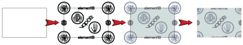
Create a rectangle that’s large enough to accommodate all of the elements that need to fit.
Step 2
Place the elements into your rectangle using even spacing and make sure you have an anchor in each corner. In this case the skull is going to be the anchor that repeats in every corner of my pattern. Creating patterns is all about what you have on the left has to correspond to what you have on the right and top to bottom as well.
The best way to ensure that you’re dead on is by using the Direct select tool to highlight a point on the corner of your rectangle and then note its x and y coordinate in the transform panel. Now use that x and y coordinate for your anchor object’s center point.
Step 3
Patterns are all about math, so to get your anchor object from one corner to the other hit Return with the object selected and use the Move dialogue box to make a copy of your object the width of your rectangle away. So if your rectangle is 300px wide, enter 300 in the horizontal field and leave the vertical field blank. Hit “Copy” and viola. Now you can select both corner pieces and use the same method to create vertical copies – just make sure if you started at the top to use a negative vertical distance.
Here’s how your corners should correspond to each other.

Step 4
Add color to your elements if you so choose. I’m using colors from my crest and my portrait to keep the whole design looking cohesive.
Step 5
Here comes the part that defines your pattern.

Select your rectangle and hit [command] + C, then [command] + F. This will duplicate the rectangle. Now with the rectangle still selected, hit [shift] + [command] + ] to bring it to the front. You can find that command up in the Object menu as well. This new rectangle will be used to crop the artwork so it can be used as a pattern swatch. Mine in the above image is a pink stroke that’s above all the other elements which is very important so as not to leave anything out.
Step 6
Select everything to be cropped and use the pathfinder panel’s “Crop” button. This should leave you with a rectangle containing your pattern.
Step 7
Select the rectangular pattern and drag it into the Swatch panel. You now have a pattern swatch that can be applied as a fill to any object.
Note: Once a pattern has been defined you will not be able to adjust the scale of the pattern. It’s a good idea to keep the original rectangular pattern vectors around in case you need to scale it up or down depending on its usage.
5) Layout
Here comes the fun part. Now it’s just a matter of putting everything together and doing some tweaking until all of the pieces become a full design.
Step 1
I start by creating a new document large enough to accommodate my skate deck template which in this case is about 8″ x 36″.

Step 2

Create a new layer called “Pattern” and duplicate the board outline on this new layer and fill it with the pattern swatch from our Pattern document. Copying over the patter to our new document is as simple as copying any object that uses that pattern fill over. An instance of the pattern swatch will then appear in the Swatches panel.
Step 3
This is where a little creative masking comes in. We need Lupe’s portrait to appear as if it’s coming out of the crest’s frame.

I prefer to work with Lupe’s portrait as a Placed object instead of all of the original artwork so I don’t accidentally mess it up and I can save my system resources by not having all of those points in addition to all of the other artwork in this large file. To import an .AI file as a linked file, go File>Place and choose the .AI document that needs to be linked. This is a live link, so if I were to make changes to my portrait file, they would automatically update here in my new layout as well. Such a badass feature of CS3!
Step 4
You can see in the last image that I created a selection to use as my mask. I used the very inside of the frame as the base of my mask and then expanded the area around Lupe’s head with the pen tool so that he appears to be emerging from the frame.

To commit the mask, select the artwork to be masked and the shape we’ve created which must be on top of all artwork intended to be masked and then you can either hit [command] + 7 or click the mask button in the layers panel or go Object>Clipping Mask>Make.
Step 5
The same technique can be used to mask off other elements, even into very complex shapes like this paint spatter here. I’ve masked off the “Trinity” logo a couple of different times in different areas so that it’s never 100% visible anywhere, but you see it enough times to get how it looks in its entirety.

I start by layering the object I’d like to appear within the spatter on top of spatter itself.

Then once it’s in place the way I want it to show through, it’s just a matter of selecting the spatter, making a duplicate on top of the logo and making a clipping mask.

With objects as large and complex (number of points and compound shapes) as this, a warning usually pops up. In this case I’ve ignored it and my mask still work beautifully. Other times you won’t be able to see anything because the mask fails due to the complexity. In cases like this you can select a portion of spatter with the Direct Select tool and copy that and use it as the mask.
Sometimes multiple masks are needed to fully mask an entire object, especially in the case of letterforms.


Step 6
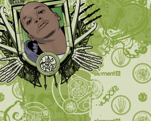
Once all of the elements are in place it’s only a matter of tweaking exact placements and in this piece, the overall color. I liked the purple muted color scheme a lot, but decided to see how it would look in some other color harmonies. I’m glad that I did because while the purple was pretty cool, I really like the way it turned out in green after all was said and done.

To change the color scheme in CS3 I have the added support of the Live Color Guide. I try to keep my artwork to a minimal amount of colors in the first place so if it’s to be screen-printed it won’t be a terror to reproduce.
Select all of the artwork in which the color is to be modified. In this case I’ve locked the portrait layer because I don’t want Lupe’s skin tones or sweatshirt to be affected. With everything selected, click the “Edit or Apply Color” wheel icon on the Color Guide panel and here’s where the magic happens.
Just by dragging around the points on the color wheel the entire color scheme of the piece changes. There are some advanced features here that would take a whole other tutorial to cover.

By creating Color Groups I’m able to present a certain design in lots of different color variations for presentations where there’s such a need to do so. Try playing around with the Live Color Guide to get a feel for it if you’re not already familiar with how it works. The Assign tab is an advanced but vital area to get to know as it will help you to build solid color harmonies.
Wrap up
So that’s the process I used to come up with this design. This turned out to be a fairly long tutorial that wasn’t necessarily as detailed about some of the techniques as I’d like them to have been, but with a lot of ground to cover I hope it’s been helpful. For future tutorials I plan to focus on one topic and provide more detail and more screenshots.
If you have any questions or would like any areas clarified go ahead and shoot me an email at dave@track6designs.com or feel free to comment below.


nice tutorial
B*tchin work, man!
how you do those custom brushes for tracing? those are dope..i am new to this stuff…
maybe make them available to download?
@big b: Um, it’s just like making any other art brush in Illustrator. Look at the screenshot just above STEP 4 to see how his look. Simply make a shape and create a new art brush. Until he (or I) make one, you’ll have to find a tutorial on how to do this. Fortunately, there are tons out there. JFGI ^_^
There is so much ground covered in this tutorial. Way to go. Also, great artwork and polished results.
@ big b:
Sorry for taking so long to get back to you. I think I’m going to make some tapering brushes available to download, but until those are up it’s pretty much like Majic said. Create a shape, say you start with a line (or a long rectangle) and have it taper at both ends by manipulating the points. Then just drag that shape into your brushes panel and choose “Art Brush”. Make sure to change the color mode to Hue Shift if you want the line to change colors, otherwise the default settings will keep the brush whatever color you originally created it with.
@ muten, Majic and Sean:
Thanks a lot guys. Glad you all found this little insight useful!
[…] Visit Tutorial […]
News » Burning Up the Web - January Roundup said this on February 13, 2008 at 3:54 am |
AMAZING!
Really impressive work, be top to see this on boards
great on
can´t wait for the detailed tutorials
do you know how to put your own designs onto skate board wheels? maybe with a special paint or something???? pls help
I was trained in old school graphic design in Jamaica and resisted the computer for a while because I am a badass designer & illustrator by hand until it dawns on me how much I was missing so i did a beginner courses and the rest on my own and I am still far behind.I was so impressed by your tutorials and the simplicity and ease of your work I will be linking with u 4 the rest of them.My passion is T-shirt design and printing and can’t wait to get started.I am looking to quit the sign Co I am working for and start working in from my basement.Where can I get some good embellishments? send me some advise. Thanks. good luck
Lloyd
[…] great tutorial from Track6 takes you through the process of generating vector resources which are then compiled to […]
30 Cool Vector Illustrated Skateboard Decks - VECTORTUTS said this on October 14, 2008 at 2:06 am |
this is so cool
thats well nice man. top job
Hi
Very awesome!So simple but fantastic.
Some Question I have is how to use vector but with beautiful tone in it and for printing do we have to start rightaway with CYMK or from RGB to CYMK and last is how do we prepare a spot color? I will be very happy to get your feedback.
[…] great tutorial from Track6 takes you through the process of generating vector resources which are then compiled to […]
Skateboard Deck Design | UneekGrafix | I Build Brands said this on September 26, 2010 at 10:11 am |